Spotting Authentic Mid-Century Cinema Memorabilia

Why does a piece of movie history matter to a modern collector?
Have you ever looked at a faded, hand-painted lobby card for a 1950s noir film and wondered if it was a genuine relic or a modern reproduction? The world of vintage film memorabilia is a minefield of high-quality reprints and clever forgeries. Understanding the physical markers of mid-century cinema production isn't just about collecting; it's about preserving the tangible connection to a lost era of studio-driven marketing. This post covers the specific physical traits, printing methods, and paper stocks used by studios like MGM, Warner Bros., and RKO to help you separate a true artifact from a clever copy.
Mid-century cinema marketing was a physical, tactile process. Before digital files and high-resolution inkjet printing, every piece of promotional material—from lobby cards to oversized posters—was a product of heavy-duty industrial machinery. If you're holding a piece that feels too smooth or looks too vibrant, you might be holding a reproduction. To truly identify an original, you need to look past the image itself and study the very fabric of the object.
How can you identify authentic lithograph posters?
One of the first things you'll notice when handling an original mid-century poster is the texture. During the 1940s and 50s, most large-scale posters were produced using stone lithography or early offset lithography. This process creates a distinct look that modern digital printers struggle to replicate. If you look at a poster under a magnifying glass (or a jeweler's loupe), you shouldn't see a pattern of tiny, perfect dots like you would on a modern inkjet print. Instead, you'll see more organic, layered ink distributions.
The paper itself is a massive giveaway. Original posters from this era often used a specific weight of paper that feels substantial but can become brittle over time. If a "vintage" poster feels like thin, modern glossy paper, walk away. Authentic vintage paper often has a matte or slightly textured finish. You can learn more about the history of printing techniques through the Library of Congress archives, which provides incredible context on how media was distributed in the early 20th century. Check the margins, too—many original posters have specific dimensions that aren't always perfectly standard by modern standards.
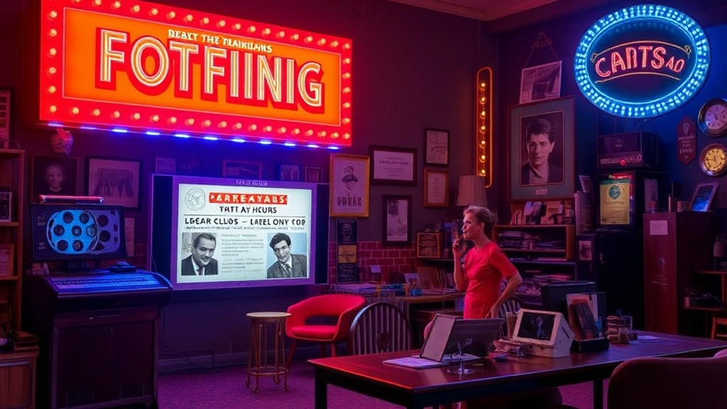
What are the tells of a genuine lobby card?
Lobby cards were small-format promotional items (usually 11x7 inches) sold to theaters to display in display cases. Because these were handled by theater employees and many customers, they often show signs of age that a reproduction won't. Look for "edge wear." A genuine card from 1952 might have slightly softened corners or minor creases from being tucked into a glass frame. If the edges are perfectly sharp and the surface is flawlessly pristine, it's a red flag.
Another detail to watch for is the ink. In the mid-century era, ink was often applied in thick layers. If you look at the card from an angle, you might see a slight indentation or a change in sheen where the ink sits on the paper. Modern copies often look "flat." If you want to see how these items were officially cataloged, the IMDb database is a great place to verify the release dates and studio lineages of the films you're researching. This ensures you aren't looking for a card for a film that didn't even exist in that specific format at the time.
The importance of studio logos and fine print
The fine print on the bottom of a poster or card is where many forgers trip up. Every studio had a specific way of displaying its logo and copyright information. For example, an RKO Radio Pictures credit might look slightly different in 1945 than it did in 1955. You should look for the specific typeface used in the copyright notice. If the font looks slightly "off" or lacks the weight of the era's standard typography, it’s likely a fake. The way the studio's name is integrated into the design is a hallmark of professional studio-mandated art.
Always check the credit block. The names of the producers, directors, and even the technical crews were part of the branding. A forged item might omit a name or use a font that wasn't common for that specific studio at that specific time. It’s these tiny, often overlooked details that define the difference between a piece of junk and a historical treasure.
How do you spot modern digital reprints?
Digital printing has come a long way, but it still leaves a footprint. If you use a high-powered magnifying glass, look for the "CMYK" pattern. Modern printers use a predictable grid of Cyan, Magenta, Yellow, and Black dots. If the image is composed of these distinct, perfectly circular dots, it’s a digital print. True vintage lithography has a more blended, sometimes even slightly grainy or stippled appearance that doesn't follow a perfect digital grid.
Furthermore, check the smell. This sounds strange, but old paper has a distinct scent—a mix of aged wood pulp and old ink. A freshly printed reproduction will often have that "new paper" or chemical ink smell. While not a scientific method, it's a sensory clue that many experienced collectors rely on. If the item feels like it was printed yesterday, it probably was.
Finally, look at the back of the item. Many vintage posters and lobby cards were kept in storage or used in theater displays, meaning the reverse side might have some discoloration, light staining, or even faint pencil marks from a theater manager. A perfectly white, clean back on a "vintage" item is often a sign that it's a modern reproduction that hasn't actually aged.
- Check for the presence of a halftone pattern under magnification.
- Examine the paper weight and texture (matte vs. glossy).
- Verify the studio logos and copyright-era typography.
- Look for physical signs of age, such as edge wear or light creasing.
- Smell the paper for a lack of modern chemical scents.